There’s this challenge found by my friend, held by Dicoding Indonesia. One of the theme was to grow the tourism sector. So here’s what is in our brain:
- Uber/Gojek clone, but with tour guides instead of driver.
- Pinterest clone, but only for tourism destination photos.

Flutter was our initial decision because there are three of us, and two are flutter developer. Yes, I’m the only one who uses React. But I wrote an app using Flutter once, so it’s really a big deal.
Until I realized that:
- This challenge has a 40 days deadline
- That app that I once wrote was just a timer with a switch
- I’m in a middle of an internship
Yeah, let’s just play it safe. I’ll just develop the web version using React, and call it a multi-platform app.
At that time, I recently found this article. and I though I’ll just use it for this project. CRA with TypeScript + React Router + React Snap + React Helmet and Tailwind for styling.
Here’s what my first design for the Pinterest clone looks like:
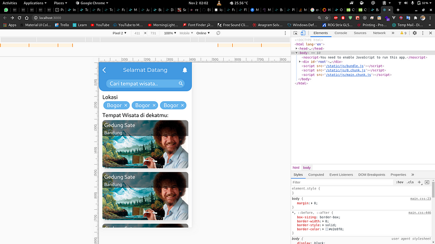
It’s in Indonesian Language.
What’s that bell button for? Why is it only displaying 2 images at a time? Why is there a back button? Is it not gonna be on the home page?
I don’t know, I just mimicking the design of the mobile version of the app.
Why? I don’t know. I feel kinda stupid and changed the design.
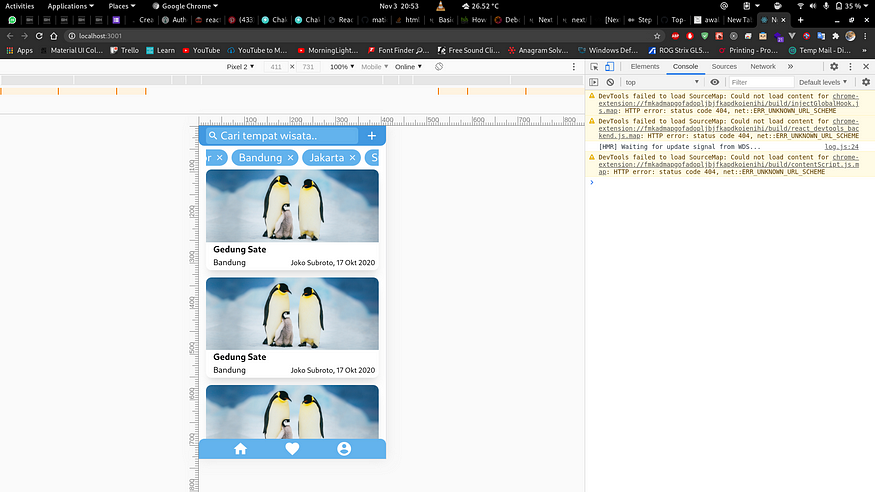
Better isn’t it?
Now you can clearly see how many pages are there. Also that search bar is now smaller. Bell button? removed.
But it still only displaying 2 (and a half) images at a time. And I didn’t even think about larger screen, so if you’re browsing the site on a desktop, use a phone instead.
No, I’m kidding. But I was kinda stressed there. What’s the point of a multi-platform app if you can only use it on a phone?
So here comes my third revision:
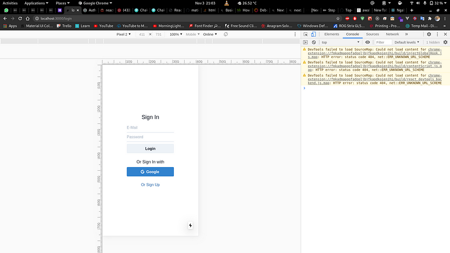
I decided that I’ll work on the homepage later, while also changing the tech stacks that I used
- Next instead of the earlier static stack. Because it’s easier to setup.
- Chakra UI instead of Tailwind. Because I don’t know how to create a good user experience.
And also I have to rewrite the app.
But it’s okay though, rather than having a bad user experience because of my mediocre skills at CSS, why not use a pre-made UI Kit (Also, deadline).
After I’m done with the login and register page, it’s time to face the true boss.
Home page.
First, I thought Chakra UI has some kind of Navigation. But boy I was hella wrong. I had to make my own Navigation Bar using its Box Component. Actually I just have to put a few icons in a box. What’s hard about that?
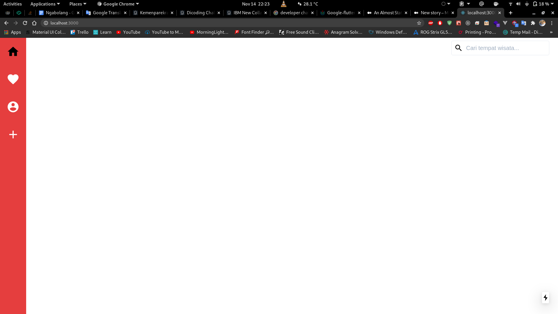
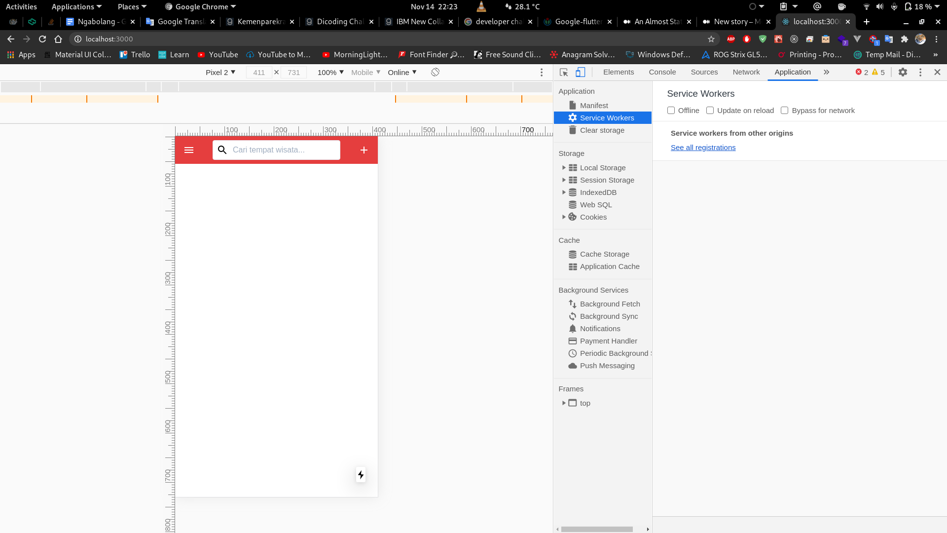
Seems familiar?
Yes it was kinda easy, mostly because I shamelessly stole the design from fireship.io
Then here’s the hard part: Make a pictures list, infinite scrolling with great performance.
I’ve heard of React Virtualized, but never used it. So I decided that this app will be the experiment lab.
I didn’t understand the documentation. Like, at all. I don’t understand it at all.
I wanted to use the Masonry Component, and here’s what it says in the Masonry docs:
Overview
Measuring and layout
Rendering occurs in two phases:
Phase 1: Measurement
This phase uses estimated cell sizes (provided by the
cellMeasurerCacheproperty) to determine how many cells to measure in a batch. Batch size is chosen using a fast, naive layout algorithm that stacks images in order until the viewport has been filled. After measurement is complete (componentDidMountorcomponentDidUpdate) this component evaluates positioned cells in order to determine if another measurement pass is required (eg if actual cell sizes were less than estimated sizes). All measurements are permanently cached (keyed bykeyMapper) for performance purposes.Phase 2: Layout
This phase uses the external
cellPositionerto position cells. At this time the positioner has access to cached size measurements for all cells. The positions it returns are cached byMasonryfor fast access later.Phase one is repeated if the user scrolls beyond the current layout’s bounds. If the layout is invalidated due to eg a resize, cached positions can be cleared using
recomputeCellPositions()orclearCellPositions().
Huh? I guess I have to learn the list component first to get the basic of this?
List
This component renders a windowed list (rows) of elements. It uses a
Gridinternally to render the rows and all props are relayed to that innerGrid. That means thatListalso acceptsGridprops in addition to the props shown below.Prop Types
(…)
Uh… that’s it about the overview?
I’ll just read this tutorial. — Erick Christian, 2020
Ok, now I know how to make a list. How does that apply to a Masonry? I don’t know.
But still, I tried it. And the result was… nothing. It showed nothing (Unfortunately the screenshot was deleted). My brain was already overheated there.
Until I found this library.
AND HELL THAT WAS A LIFESAVER.
Just list your item there, and boom. It just works. (No screenshot either)
Not really done, but I guess I’ll continue this story later.
Here’s what I learned so far:
- I should’ve just used Flutter because this is just a challenge
- I know how to use Next and React Virtualized (even though only the basics)
- I know how to deploy a Next app to Netlify
- Must know how to CSS if you use Tailwind
What do you guys think?
Anyway, thanks for reading. Cheers.